Scalable Analytics: Building a Dynamic Statistic Matrix in PowerBI
In data analytics, we often face the “Paradox of Choice.” Stakeholders want to see every statistical distribution—Mean, Median, Percentiles, and Standard Deviation—across every metric and every business segment.
Usually, this leads to dashboard bloat. Today, I’m sharing how I built a Dynamic Statistic Overview that stays clean, remains incredibly easy to scale, and allows for deep-dive segment analysis on the fly.
The Strategy: The “Double-Switch” Method
The goal was to create a single visual that acts like a Swiss Army knife. To do this, I combined three Power BI power-features: Disconnected Tables, DAX Switching, and Field Parameters.
1. The Statistical “Brain” (DAX)
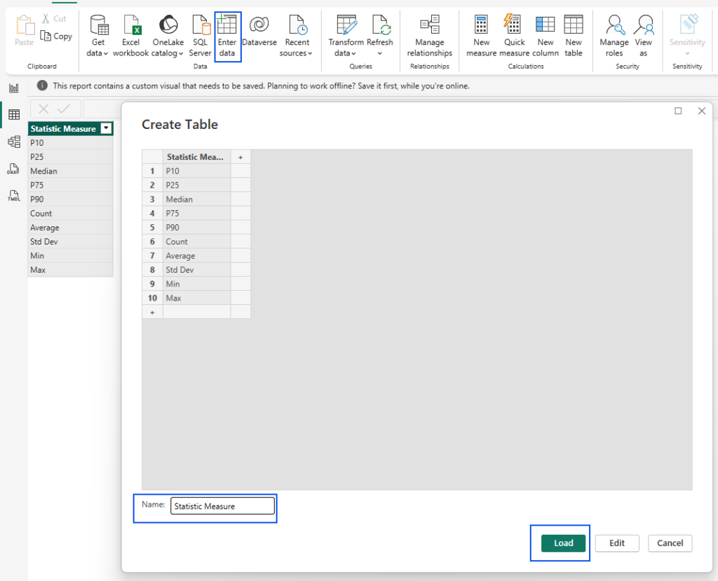
First, I created a dummy table with my row headers (Average, Median, P10, etc.).
Then, I wrote a SWITCH measure to tell Power BI exactly how to calculate each row based on the user’s selection:
Statselector Payment_Terms =
SWITCH (
    SELECTEDVALUE('Stats_Selector'[Statistic Measure]),
    "P10", PERCENTILE.INC('customers_master'[Payment_Terms], 0.10),
    "P25", PERCENTILE.INC('customers_master'[Payment_Terms], 0.25),
    "Median", MEDIAN('customers_master'[Payment_Terms]),
    "P75", PERCENTILE.INC('customers_master'[Payment_Terms], 0.75),
    "P90", PERCENTILE.INC('customers_master'[Payment_Terms], 0.90),
    "Count", COUNT('customers_master'[Payment_Terms]),
    "Average", AVERAGE('customers_master'[Payment_Terms]),
    "Std Dev", STDEV.P('customers_master'[Payment_Terms]),
    "Min", MIN('customers_master'[Payment_Terms]),
    "Max", MAX('customers_master'[Payment_Terms]),
    BLANK())
2. Scaling with Field Parameters
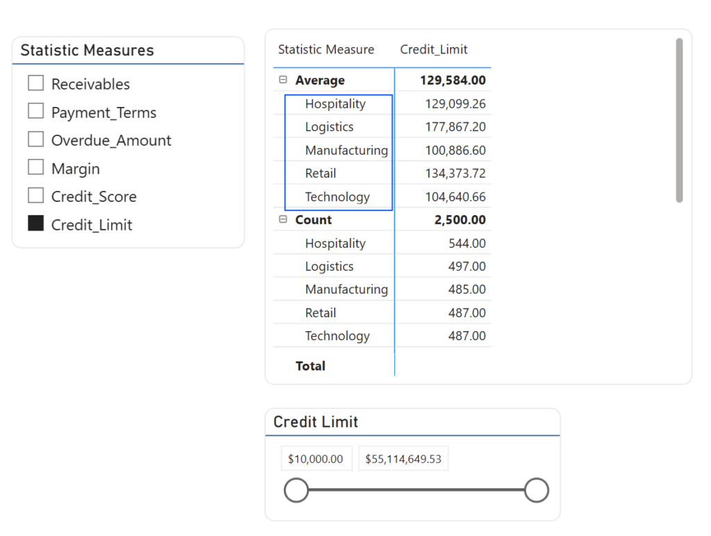
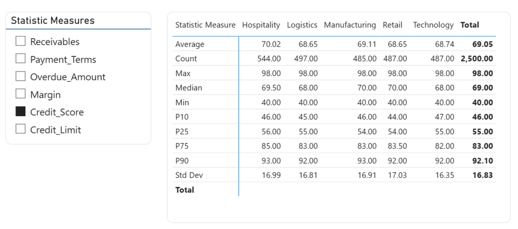
To avoid building a separate table for every metric, I used Field Parameters. This bundles my individual “Statselector” measures into one dynamic filter. This allows the user to toggle between Margin, Credit Limit, and Receivables in the same visual space.
Statistic_Measures = {
    ("Receivables", NAMEOF('_Measures'[Statselector Receivables]), 0),
    ("Payment_Terms", NAMEOF('_Measures'[Statselector Payment_Terms]), 1),
    ("Overdue_Amount", NAMEOF('_Measures'[Statselector Overdue_Amount]), 2),
    ("Margin", NAMEOF('_Measures'[Statselector Margin]), 3),
    ("Credit_Score", NAMEOF('_Measures'[Statselector Credit_Score]), 4),
    ("Credit_Limit", NAMEOF('_Measures'[Statselector Credit_Limit]), 5)
}
The “Killer Feature”: Dynamic Segmentation
The real magic happens when you combine this setup with your existing data model dimensions.
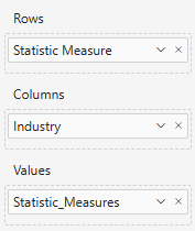
Because the DAX measures are context-aware, you can drop a field like Industry into the Columns of your Matrix.
Why this is a Game Changer:
Automatic Intersection: The matrix automatically calculates the P10 or Median specifically for “Hospitality” “Logistics” and all other categories.
Infinite Drill-Down: You can swap “Customer Segment” for “Region,” “Manager,” or “Product Category.” The statistical logic remains the same, but the insights shift instantly.
- Automatic Intersection: The matrix automatically calculates the P10 or Median specifically for “Hospitality” “Logistics” and all other categories.
- Infinite Drill-Down: You can swap “Customer Segment” for “Region,” “Manager,” or “Product Category.” The statistical logic remains the same, but the insights shift instantly.
- Comparison at Scale: You can compare the Standard Deviation of
Credit Scoreacross four different segments side-by-side in one compact view
Infinite Drill-Down: You can swap “Customer Segment” for “Region,” “Manager,” or “Product Category.” The statistical logic remains the same, but the inights shift instantly.
Why This Approach Wins
1. Space Efficiency
Traditional reports grow horizontally until they are unreadable. This method keeps your statistics locked to the Rows, allowing your segments or dates to expand naturally across the Columns.
2. Reduced Maintenance
If you need to add a new statistic (like a 95th percentile), you update the DAX logic in your measures. While this requires a bit of manual work—which can be easily handled in bulk via TMDL (Tabular Model Definition Language)—it is significantly faster than rebuilding dozens of individual report cards.
3. User Empowerment
You aren’t just giving users a report; you’re giving them a discovery tool. They can choose the metrics they care about, the statistics that matter to their role, and the segments they need to compare—all within a single visual.